Case study · Apollo 24/7
From days to hours: building Capsule, Apollo 24/7’s design system
Apollo 24/7’s products had grown faster than their foundations: every team built its own buttons, and the cracks showed. I led the team that built Capsule, one design system for web and app, and cut interface design time from days to hours.
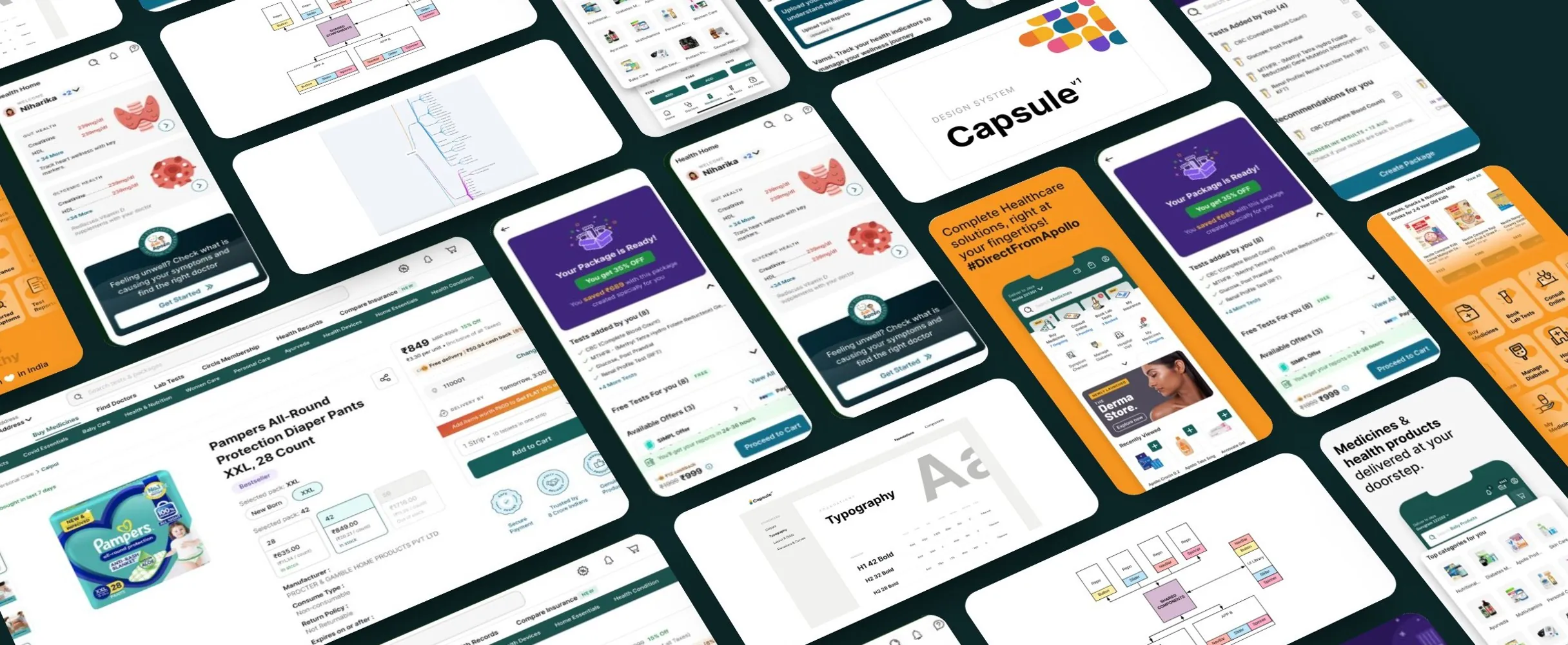
- Days → hoursInterface design time
- 1Shared system for web and app
- 5Problems turned into acceptance criteria
The problem
Every team had built its own buttons
Teams across projects had each invented their own elements: different paddings, button sizes, fonts and page structures, plus broken CSS and failing colour contrast. It showed in the product, and with millions of users and WCAG standards to meet, it was also a quality risk.
Everyone could see it:
- “Why do these titles have varying font weights and paddings?”Ajay Bansal, Product Lead
- “Primary buttons have an icon in some places and not in others.”Sachin Kumar, Front-End Engineer
Who it served
I’d built systems before, so I started with the right questions
Experience had taught me that a design system fails on adoption, not on components. So before any design, I took stakeholders through the questions that decide adoption: why we needed a system, who it was for, what success looked like, and what was in scope. I benchmarked how Google, IBM, Atlassian and Airbnb run theirs, to pick the patterns that would fit Apollo.
Capsule had three groups to serve:
- Our designersA maintained source of truth they could actually stay in sync with.
- Our engineersShared components instead of rebuilding the same ones.
- External developersWidgets that feel native to Apollo, from a public part of the system.
Criteria
Five problems became our acceptance criteria
We named exactly what Capsule had to fix, and judged every component against it:
- InconsistencyContrast, components and broken CSS were hurting the experience and the brand.
- RedundancyDesigners and developers kept rebuilding the same screens.
- RigidnessNo button hierarchy, no structure for states across platforms.
- CommunicationChanging a component safely means knowing where it’s used, and announcing it.
- AccessibilityInclusive by default, not left to each developer’s expertise.
Building it
Built atom by atom, with engineering
We formed a joint team of designers and engineers and used Atomic Design as the structure. I mapped every component in use across our platforms into atoms, molecules and organisms, and we built up from the atoms: type, colour, icons, buttons and inputs. I also ran the ideation workshops and design showcases, and kept scope in step with the product roadmap.
Impact
Days of design work became hours
Capsule paid for itself at every level:
- DesignHigh-fidelity screens assembled from ready parts, in hours instead of days.
- DevelopmentA shared language with design; conversations moved from pixels to features.
- ExperimentationPrototypes and A/B variants fast enough to actually test ideas.
- CustomersExternal developers built widgets that feel native to Apollo.
Reception
Users loved the new look
Lessons
What I’d take into the next role
Three lessons I’m taking with me.
- Changing a component costs more than making oneSo we set up a dedicated channel for system changes; nothing moved silently.
- Keep design and code in syncIf Storybook and the Figma library drift apart, the system splits in two.
- A system binds as much as it enablesIts patterns can feel limiting, but that constraint is what lets teams work together.