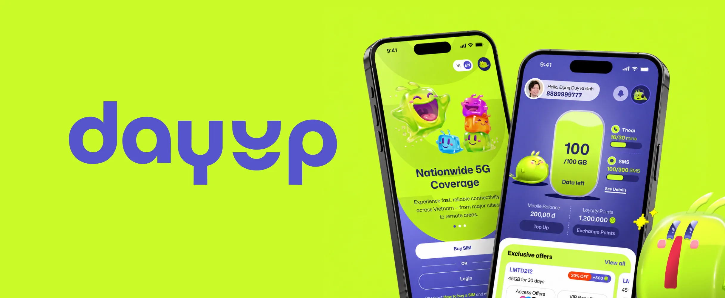
LMTD21220% OFF+500
45GB for 30 days
Access OffersVIP Benefits
1,240,000 đ1,500,000 đ
Case study · Circles.Life × VNPT, Vietnam
VNPT wanted a Gen Z mobile brand, but there were no requirements and no brand identity yet. I led a three-person design team from research to a build-ready experience in one quarter. VNPT approved it, and it launches in October 2026.
Research
Circles.Life’s platform could run VNPT’s new brand. What it couldn’t tell us was why a young customer would leave the carrier they already had. So before anyone designed a screen, I set up discovery in Hanoi with VNPT’s product managers.
I wrote a survey for young mobile users, and 171 answered. It showed us where people got stuck, but not why. So I turned those findings into an interview guide, and we ran 12 interviews. They changed our minds on onboarding: going digital wasn’t the fix, explaining each step was.
By the end, we knew what Gen Z wanted from DayUp:
The setup
We knew what Gen Z wanted. Now we had to design it before any PRDs existed, while an outside agency was still creating the brand. I set the direction, split the journeys between two designers and myself, and stepped in wherever a journey was critical or slipping.
Every call I made balanced four tensions:
Process
Waiting for PRDs would have cost us the quarter. And three teams were working across three languages: VNPT in Vietnamese, KDDI in Japanese, and our team in India in English. Long documents got lost in translation; a screen didn’t.
So I moved design upstream. We sketched low-fidelity wireframes and built clickable prototypes in Figma Make, then used them to drive every conversation: capture feedback, agree the scope, and only then write the PRD. VNPT approved the journeys first. The PRDs came after and mostly wrote up what we’d designed.
Decisions
VNPT needed a credible proposition, engineering needed something it could build, and the agency needed room for a brand still taking shape. My job was to make the trade-offs visible, recommend the smallest change that kept the journey coherent, and stop decisions being reopened.
Three calls show how that worked:
Home screen
The home decision had to hold up in every situation, not just the two we’d argued about. So we designed four states. Usage, balance and navigation never move. What changes is the order below them, and one alert when the plan runs out.
Principles
Calls like the home screen couldn’t all come through me. So I wrote five experience principles, each one traced to a real screen. When requirements changed, and they kept changing, the team used them to make the next call on their own.
Onboarding
The hardest journey came first. Vietnamese eKYC, consent and customer data meant we couldn’t cut a single required step. So we made each one understandable, kept customers oriented, and gave every outcome a next step. VNPT approved the full journey, and engineering built the core flow from our specs.
Design system
The brand was still moving, so we built a system that could absorb change: tokens, behaviour rules and 40+ reusable components. DayUp stays bold in discovery and calm wherever customers share ID or pay.
DayUp design system · a peek
The agency gave us a personality. We turned it into tokens, rules and components that every journey reused. These are the real pieces, rebuilt in code.
01 · Personality
The tension: feel energetic without losing trust where customers share ID or pay.
02 · Colour roles
03 · Type & spacing
04 · Components, as built
45GB for 30 days
Offer card
Home · Shop · Plans
Add-on card
Home · Checkout
Filter chips Try it
Plans · Shop
Progress stepper
Checkout · eKYC
Button pair
eKYC · Payment · Modals
Status header
Payment · Rewards · eKYC
05 · Behaviour rules
Localization
Translation was the easy part. We reviewed tone, terms and imagery with VNPT, took cultural guidance from the agency, and benchmarked local carriers. The lucky-number finding showed up here too.
DayUp · Designing for Vietnam
Identity, place and even the numbers people choose had to feel local. These are the details, rebuilt in code.
Step 1
Upload CCCD front image
Add a clear front page photo of your CCCD
Identity
The ID people carry
eKYC names the CCCD citizen ID directly, not a generic “identity document”.
Verify information via VNeID
To ensure safety and compliance, please verify through the VNeID app
Connect to VNeIDNational systems
VNeID, with the reason
Verification runs through Vietnam’s national identity app, and says why.
Only in Hanoi
View allLocal relevance
City-specific deals
“Only in Hanoi” surfaces offers that matter where the customer lives.
# Find your lucky number
Search by birthdate or year
Culture · from the interviews
Numbers carry meaning
Lucky, feng shui, birth-year and zodiac numbers came straight from the interviews, not a brief.
How it was checked
Quality & AI
Handoff isn’t where quality is won. I set up a build review against the approved designs, with every gap logged in one ticket format. Once the design system landed, design issues fell from 22% to 10% of QA bugs. Most were small spacing and layout slips, the kind that creep in when many people build the same screens.
Then we let AI take the repetitive work on both sides. In August we got beta access to Figma agents and used them on new requirements: they turned our components into finished designs much faster, and gave the team breathing space. Engineering was already pushing for Cursor, so I proposed pairing it with Figma MCP. They could then generate UI straight from those same components, with fewer UI issues reaching review.
Outcomes
DayUp hasn’t launched yet, so there are no results to claim. Here’s what we delivered, and what we’ll measure once customers arrive.
Feedback
Lessons
Three lessons I’m taking with me.
P.S. DayUp launches in October 2026. I’ll update this page with what customers actually do.