Case study · Waah Jobs (OLX Group)
Onboarding, not screening: 61.7% to 82.4% in three weeks
Jobseekers were leaving Waah Jobs before they ever saw a job. I rebuilt onboarding around one question: what’s the least we need to ask before showing someone a relevant job? Conversion rose from 61.7% to 82.4%.
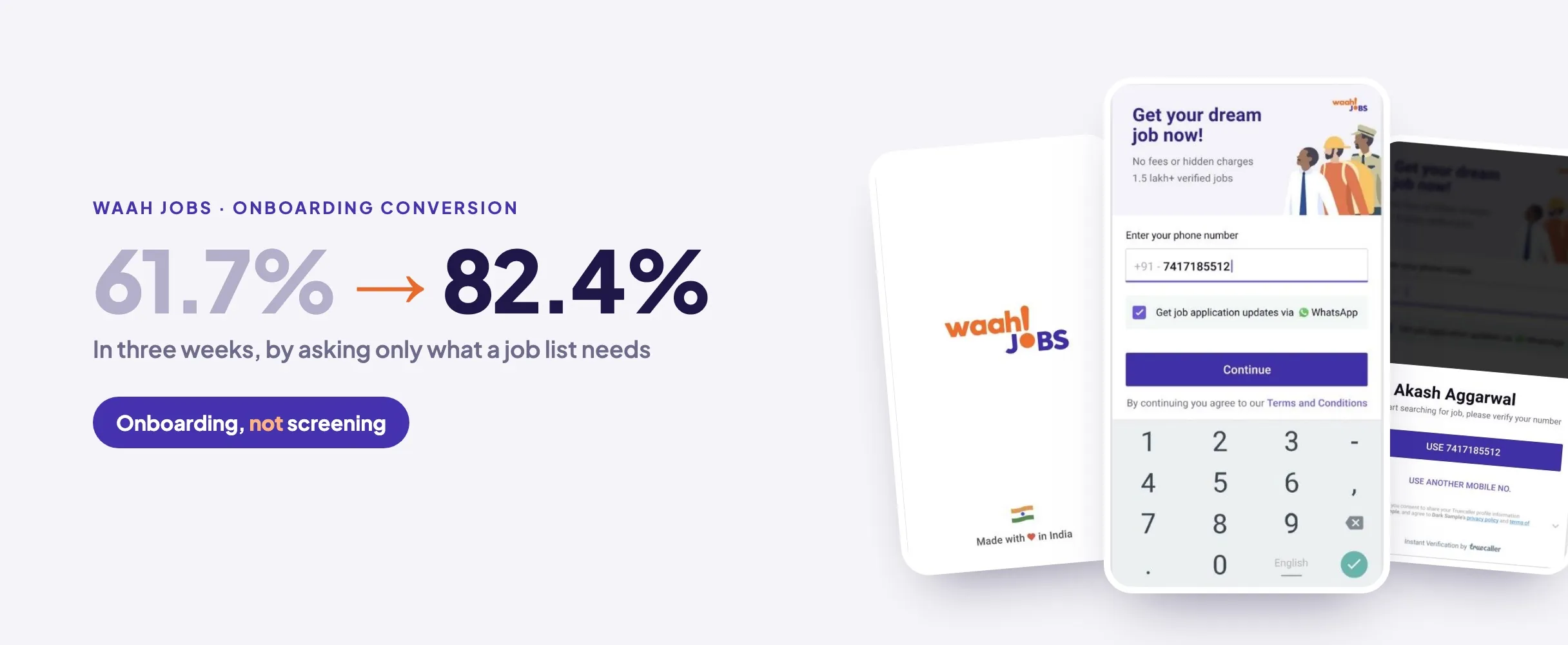
- 61.7 → 82.4%Onboarding conversion
- −36%Worst per-screen drop, eliminated
- 3 weeksFrom problem to shipped flow
The drop-off
Every screen lost more people
Our app research had named onboarding as the biggest leak. The flow asked for 20+ details, copied from white-collar job boards whose users have CVs ready, before showing a single job. For blue-collar jobseekers it was a wall, and the funnel showed it.
What we knew
We already knew more than we thought
Before designing anything, I went back through past A/B tests and interviews for this exact flow. Four things stood out:
- Phone beats social loginUsers feared sharing social accounts and preferred a phone number with OTP.
- Trust is fragileJob fraud is common, so asking a lot up front read as a red flag.
- Small steps beat wallsShort contextual pages tested better than one long form.
- Email is a dead endOnly 6.4% had an email they actually used, and everyone forgot passwords.
The reframe
Onboarding isn’t screening
In a brainstorm with my PM and design manager, I questioned the requirement instead of the screens. We needed all that data to match a perfect job, but did we need it before people even understood the product?
That became the rule for the whole flow: ask only what’s needed to show a relevant job list, tune search to work from those few answers, and collect the rest later, when its value is obvious.
Three moves
Three moves did the work
I worked through flows and low-fidelity screens before any UI, then tested a clickable prototype before build.
- Lead with trustA Made-in-India splash and a landing screen that answers the fraud fear first.
- Remove the keyboardTruecaller one-tap login skipped typing and pre-filled the profile.
- Make it feel shortAnything a job list didn’t need moved out; the rest became quick taps.
Results
61.7% to 82.4%, and the rest of the profile later
After launch, onboarding conversion rose from 61.7% to 82.4%. For the profile details we no longer asked up front, we mapped nudge points later in the journey, at moments where people can see that more information means better jobs.
Lessons
What I’d take into the next role
Three lessons I’m taking with me.
- Question the requirement, not the screenThe biggest win came from asking why we needed the data, not from a better form.
- Borrowed patterns need a fit checkA flow built for white-collar CVs failed people who don’t have one.
- Time to value is the metricGetting people to a relevant job fast mattered more than a complete profile.